Blog Layout

Studiograph • Jul 08, 2020

The business that change lives

Change life Australia is a business organization that offers professional services in the national disability insurance scheme (NDIS) line. Their team has been in the business for 20 years. They clearly understood the importance of brand identity before setting off on their adventure. 

Most importantly, they recognized how important it is to engage the service of expertise in branding and execution. This was what prompted them into choosing STUDIOGRAPH (Of course, our success stories in this field are too obvious to be hidden).

All it took them was booking a session with us. Our swift response team scheduled a meeting with them to understand their needs. The contents of their services were all it takes to develop matching brand identity from scratch, which affords them a competitive advantage.


We did their branding, logos, visuals, contents, and website at https://changelifeaustralia.com.au We also supplied them with all designs required and print materials.

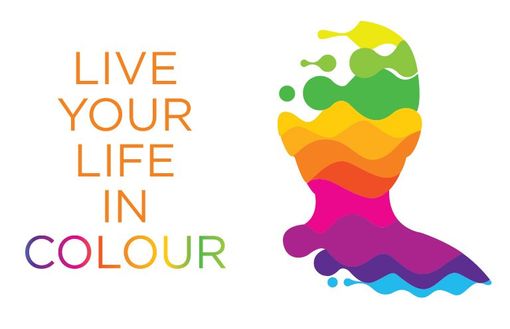
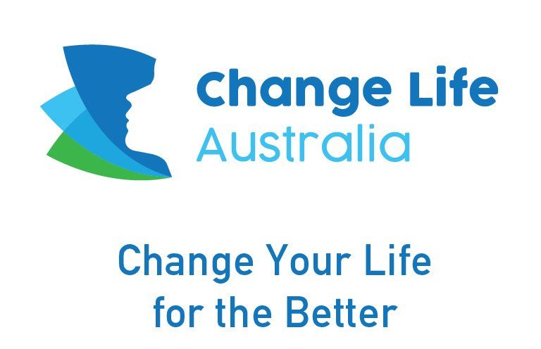
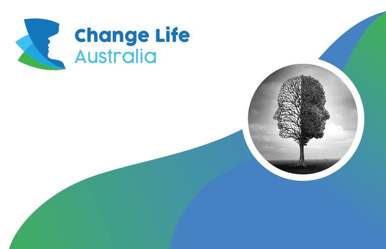
The concept of the logo's design was a face looking up in despair for support resting on three leaves of different shades of color blue and green. The green-colored leaf depicts hope for the people in need, renewal, and life. The blue-colored leaf represents the organization's in-depth concern for clients' welfare and compassion for taking care of their needs.


The brand identity gave Change Life Aaustralia its modern edge amidst their competition in the NDIS market.

Recent Posts

UpHill
By Studiograph 01 Aug, 2020
Team Uphill approached Studiograph during their preparations in starting the new venture. With more than 10 years of experience in the industry, they had a clear idea on what values their brand should have. This made our briefing session much easier. The challenge for Studiograph was to offer a unique identity that would help UpHill stand out in the Real Estate Agency crowd, and among the established big names in the industry. The concept is developed on a light green parallelogram based identity. It acts as he ‘Shade’ of support & assistance. The ‘cool’ light green colour stands for comfort – of home and the service offered by UpHill.
reliableadvisers
By Studiograph 09 Jun, 2020
Reliable Advisers is mainly into insurance financial services. The company approached us at its inception and entrusted us with the full responsibility of branding their business, having learned about our success stories. We set to work by first giving them options of names to choose from. Reliable Advisers was chosen after a tough session of having to choose just one out of the unique options of names presented to them.
Share by: