Blog Layout

Studiograph • Jun 09, 2020

The beginning of a Reliable brand

Reliable Advisers is mainly into insurance financial services. The company approached us at its inception and entrusted us with the full responsibility of branding their business, having learned about our success stories. 

We set to work by first giving them options of names to choose from. Reliable Advisers was chosen after a tough session of having to choose just one out of the unique options of names presented to them.

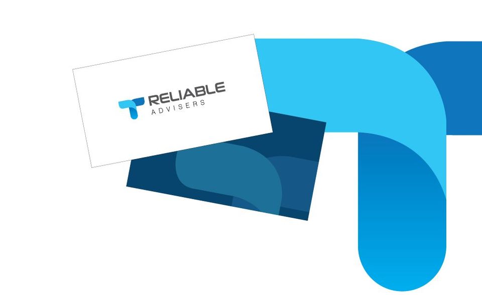
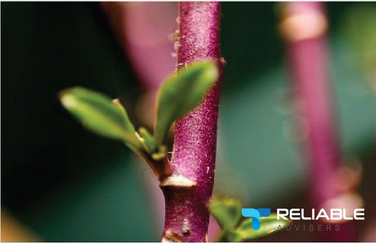
We designed three sets of brand logos in different color combinations for them. These extra efforts offer our clients flexibility in choosing the best and unique one out of an excellent set of options provided to them. Option one was a plant bud that connotes care; the second option was a butterfly, connoting life, while the third was a road, depicting the journey. The first option, plant bud, which depicts care, was chosen by the client.

Having chosen a unique brand name and logo, we designed visuals needed for campaign marketing and then created a bespoke and user-friendly website https://www.reliableadvisers.com.au for the brand. All previously created tools for brand identity were incorporated into the website.


Reliable advisers still enjoy our after sales service & continued support and never hesitates to choose us for their branding and execution related services as and when due throughout their development phase.

Recent Posts

UpHill
By Studiograph 01 Aug, 2020
Team Uphill approached Studiograph during their preparations in starting the new venture. With more than 10 years of experience in the industry, they had a clear idea on what values their brand should have. This made our briefing session much easier. The challenge for Studiograph was to offer a unique identity that would help UpHill stand out in the Real Estate Agency crowd, and among the established big names in the industry. The concept is developed on a light green parallelogram based identity. It acts as he ‘Shade’ of support & assistance. The ‘cool’ light green colour stands for comfort – of home and the service offered by UpHill.
studiograph Branding
By Studiograph 08 Jul, 2020
Change life Australia is a business organization that offers professional services in the national disability insurance scheme (NDIS) line. Their team has been in the business for 20 years. They clearly understood the importance of brand identity before setting off on their adventure. Most importantly, they recognized how important it is to engage the service of expertise in branding and execution. This was what prompted them into choosing STUDIOGRAPH (Of course, our success stories in this field are too obvious to be hidden).
Share by: